Kitchen Paint Colors
 Kitchen Colors
When people talked about colors in their kitchens 10 or 15 years ago, they tended to use the same very few boring colors. But, these days you have a lot of options available to you in terms of colors, and that includes bright, bold and beautiful options like red, yellow, green and blue. You simply have to know how to use these colors and where to use them at. These colors can be painted on walls, obviously, but you can also use these colors as a basis to paint certain features in the house, wooden cabinets, flooring, etc. If you are really lucky you may even be able to grab a color or two and take it to your local woodworker or Masonry Company and they can actually use the color you choose to place it as a tint in your flooring, countertops and more. Below, you are going to find some really awesome bold colors, some ideas on where to put them and how to use them, and you will also see some examples of those colors in various hues.
Red Color Paint
Red is an awesome color to use in the kitchen - it’s bright and beautiful, but it also stimulates the appetite, which is a good option for people that love to eat and cook in the kitchen. But, when it comes to red, what color should you use? There are bold and beautiful, subdued, reddish orange and so many more options to choose from. First, let’s talk about where to place red. Red is a good place for countertops, but it also works really well when it comes to certain pieces of appliances in the kitchen to create a dynamic look such as conventional ovens, the natural wood cabinets in your kitchen - but not all of them, just a few here are there, supported by black paint on the other cabinets. You can also use red as a focal point, accent wall, accent items like shades for your lamps, cooking utensils and more. Some reds to consider: Farrow & Ball - Rectory Red, Ben Moore currant red, Heartthrob, Sherwin-Williams and Valspar Cut Ruby.
Orange Color Paint
Orange works a lot like red in that it grabs people’s attention. Using this in your kitchen is not going to be a ho hum boring color and chances are you are really going to surprise people with it because it’s not a safe color - safe is white. This is daring, bold and unique. But, you also have to use it in the right way with the right colors. For example, using orange, especially that yellow orange pumpkin color and black, is going to bring a certain sense of Halloween to the table and that’s not something you want to do by any means. So instead, you would want to use materials that complement orange; natural woods, bronze and copper chandeliers, chocolate brown leather chairs, etc. White also goes really well with orange. So consider painting the backsplash orange and the cabinet’s white, add in a really beautiful brown wood floor, and copper tinted or steel counters and you have a fantastic look! Some orange paints to consider are: Benjamin Moore sweet orange, Glidden Sunbaked Orange Interior Paint, Valspar Autumn Blaze and one of my favorites SW6881 Cayenne.
Green Color Paint
Green is one of those colors you have to be super careful with and it can sometimes be tricky in picking the right green. The right green can make you feel invigorated or refreshed. The wrong green can make you feel sick, nauseous, or overwhelmed. Green in a kitchen, like red stimulates an appetite, but for a different reason; most foods we eat, or are supposed to eat are green! So green goes perfectly in a kitchen. You can use this as an accent color as a backsplash and then paint knobs on drawers and cabinets, or you can paint the cabinets green - but again not all the cabinets, make sure you leave some bare wood as well, green and wood look really good together. Adding in another color, you can consider black and white marble, black granite or onyx for the counter tops. Green colors to check out in the kitchen: Ben Moore fern wood green, SW6730 Romaine - Sherwin-Williams, Glidden Fresh Guacamole Interior Paint or Low VOC Grass Wall Paint | Serena & Lily.
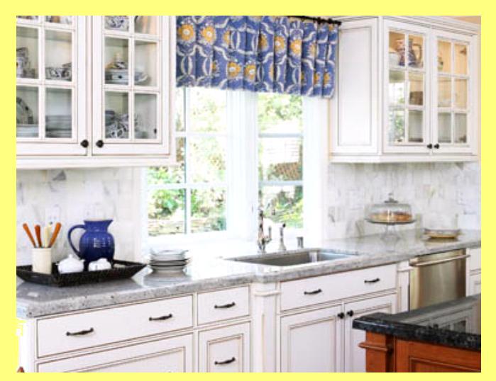
Blue Color Paint
Blue is known as the color that helps people relax and unwind. It’s the reason why a lot of people choose to paint their bedrooms blue, because it helps put you to sleep and keep you asleep. It’s really a quite relaxing color, but the wrong shades can also lead to being an appetite suppressant! Funny little things you find out when reading blogs like this one. I bet most of you never knew that this little tricky color can be used in the kitchen and will actually make you want to eat less! Blue, any blue in my eyes, is awesome. But, if you are using it in the kitchen consider using a watery hue rather than a deep hue, and try using it in minimal spots, rather than big surface spaces like cabinets. One idea is to use it on the kitchen island cabinets which is a great focal point. You can also find an even more minimal space if you have metal hanging lights above your island, you can paint the top most part of the lights blue - its minimal, but noticeably, believe me! Here are some blues to check out! Valspar Sea Sparkle, BEHR Blue Willow, SW6531 Indigo - Sherwin-Williams and Ben Moore Blue Dusk!
Red Color Paint
Red is an awesome color to use in the kitchen - it’s bright and beautiful, but it also stimulates the appetite, which is a good option for people that love to eat and cook in the kitchen. But, when it comes to red, what color should you use? There are bold and beautiful, subdued, reddish orange and so many more options to choose from. First, let’s talk about where to place red. Red is a good place for countertops, but it also works really well when it comes to certain pieces of appliances in the kitchen to create a dynamic look such as conventional ovens, the natural wood cabinets in your kitchen - but not all of them, just a few here are there, supported by black paint on the other cabinets. You can also use red as a focal point, accent wall, accent items like shades for your lamps, cooking utensils and more. Some reds to consider: Farrow & Ball - Rectory Red, Ben Moore currant red, Heartthrob, Sherwin-Williams and Valspar Cut Ruby.
Orange Color Paint
Orange works a lot like red in that it grabs people’s attention. Using this in your kitchen is not going to be a ho hum boring color and chances are you are really going to surprise people with it because it’s not a safe color - safe is white. This is daring, bold and unique. But, you also have to use it in the right way with the right colors. For example, using orange, especially that yellow orange pumpkin color and black, is going to bring a certain sense of Halloween to the table and that’s not something you want to do by any means. So instead, you would want to use materials that complement orange; natural woods, bronze and copper chandeliers, chocolate brown leather chairs, etc. White also goes really well with orange. So consider painting the backsplash orange and the cabinet’s white, add in a really beautiful brown wood floor, and copper tinted or steel counters and you have a fantastic look! Some orange paints to consider are: Benjamin Moore sweet orange, Glidden Sunbaked Orange Interior Paint, Valspar Autumn Blaze and one of my favorites SW6881 Cayenne.
Green Color Paint
Green is one of those colors you have to be super careful with and it can sometimes be tricky in picking the right green. The right green can make you feel invigorated or refreshed. The wrong green can make you feel sick, nauseous, or overwhelmed. Green in a kitchen, like red stimulates an appetite, but for a different reason; most foods we eat, or are supposed to eat are green! So green goes perfectly in a kitchen. You can use this as an accent color as a backsplash and then paint knobs on drawers and cabinets, or you can paint the cabinets green - but again not all the cabinets, make sure you leave some bare wood as well, green and wood look really good together. Adding in another color, you can consider black and white marble, black granite or onyx for the counter tops. Green colors to check out in the kitchen: Ben Moore fern wood green, SW6730 Romaine - Sherwin-Williams, Glidden Fresh Guacamole Interior Paint or Low VOC Grass Wall Paint | Serena & Lily.
Blue Color Paint
Blue is known as the color that helps people relax and unwind. It’s the reason why a lot of people choose to paint their bedrooms blue, because it helps put you to sleep and keep you asleep. It’s really a quite relaxing color, but the wrong shades can also lead to being an appetite suppressant! Funny little things you find out when reading blogs like this one. I bet most of you never knew that this little tricky color can be used in the kitchen and will actually make you want to eat less! Blue, any blue in my eyes, is awesome. But, if you are using it in the kitchen consider using a watery hue rather than a deep hue, and try using it in minimal spots, rather than big surface spaces like cabinets. One idea is to use it on the kitchen island cabinets which is a great focal point. You can also find an even more minimal space if you have metal hanging lights above your island, you can paint the top most part of the lights blue - its minimal, but noticeably, believe me! Here are some blues to check out! Valspar Sea Sparkle, BEHR Blue Willow, SW6531 Indigo - Sherwin-Williams and Ben Moore Blue Dusk!
